Visualize Transit Usage Across Puget Sound
I’m excited to announce a new addition to the OneBusAway website: an interactive ridership map that visualizes how people are using the OneBusAway app throughout the Puget Sound region.
See the Live Version
You can explore it now at the Puget Sound Ridership page.
Source Code
You can find it on GitHub, published under the Apache 2.0 license, in the onebusaway/usage-map-visualization repository.
Why This Matters
Transit agencies and urban planners have long relied on ridership data to make decisions about service planning, but this data has traditionally been siloed and difficult to access. Meanwhile, those of us who build transit apps have had limited visibility into how our tools are actually being used in the real world.
The OneBusAway ridership map changes that. By visualizing aggregated, anonymized usage data across thousands of transit stops, we can now see patterns that would otherwise remain hidden in spreadsheets and database tables.
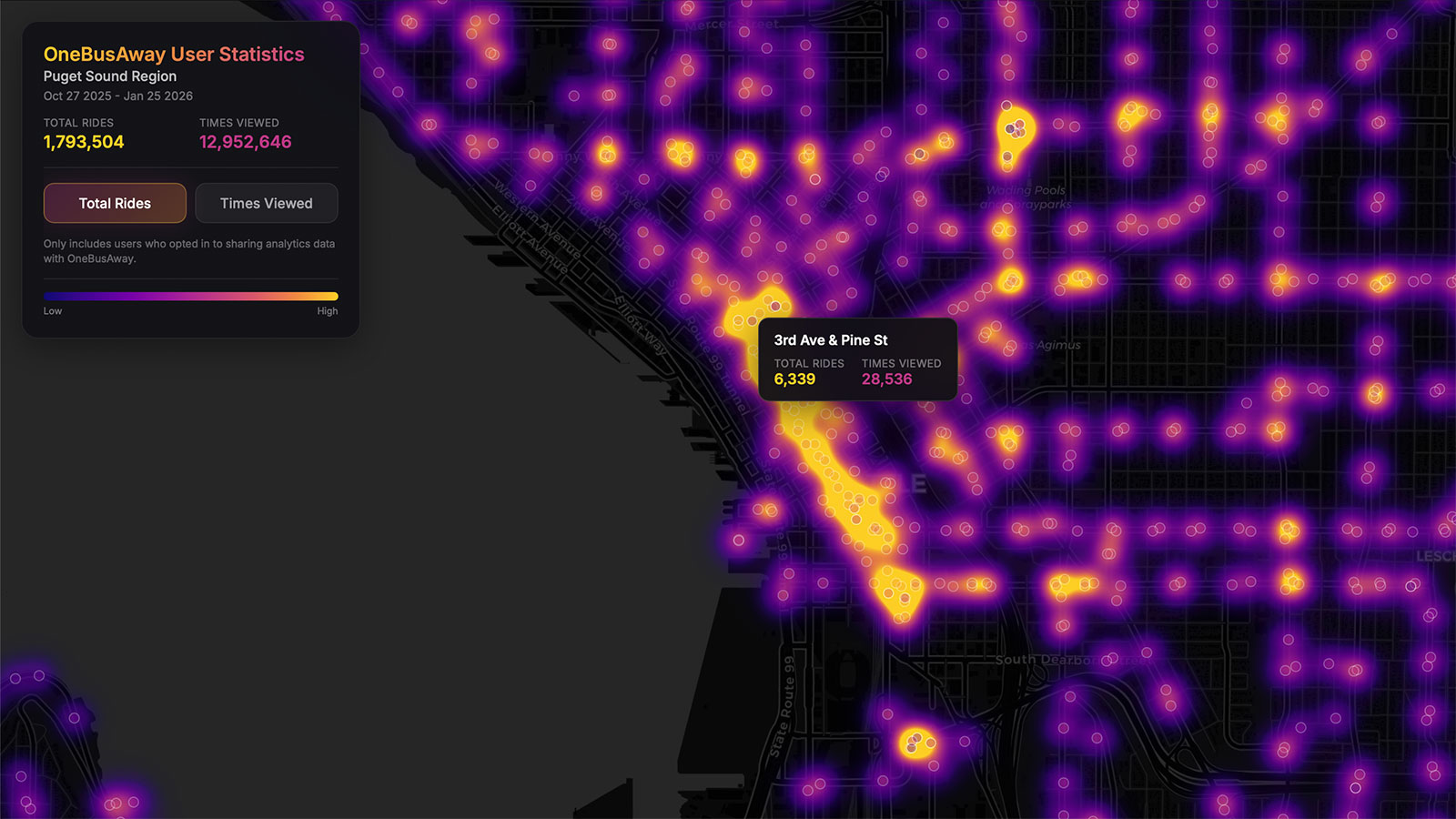
What the Map Reveals
The visualization displays two key metrics for each transit stop in the Puget Sound region:
- Total Rides: The number of times users checked arrival information before boarding transit at that stop
- Times Viewed: The total number of times users viewed real-time arrival information for that stop
These metrics tell different but complementary stories. A stop with high “Total Rides” but relatively lower “Times Viewed” suggests commuters who check the app once and go. Conversely, stops with disproportionately high view counts might indicate locations where people are waiting longer or checking multiple routes.
Some of the patterns that emerge are exactly what you’d expect—downtown Seattle and major transit hubs light up like beacons. But there are also surprises: neighborhood corridors with unexpectedly high usage, suburban park-and-rides that punch above their weight, and quiet stops that turn out to be more important than their surroundings might suggest.
How We Built It
The ridership map is entirely client-side, built with MapLibre GL for smooth, GPU-accelerated rendering. When you load the page, your browser fetches a JSON file containing aggregated stop-level statistics and renders it as an interactive heatmap.
The data pipeline works like this:
- Google Analytics collects anonymized, opt-in usage events from OneBusAway users
- A daily cron job processes this data and generates aggregated statistics per transit stop
- The JSON file is published to a Cloudflare bucket, making it fast and globally accessible
- Your browser downloads this data and renders the visualization locally
This architecture keeps things simple and scalable. There’s no backend server handling map requests—everything runs in the browser, which means the visualization stays fast even under heavy load.
The heatmap uses a logarithmic scale to handle the wide range of usage levels across stops. Without this, the busiest downtown stops would dominate the visualization and obscure activity everywhere else. The plasma color scheme (ranging from deep purple through magenta to bright yellow) was chosen for both aesthetics and accessibility.
When you zoom in past a certain threshold, the heatmap transitions to individual circles for each stop, allowing you to hover over specific locations and see detailed statistics.
Privacy First
It’s worth emphasizing that this visualization only includes data from users who have opted in to sharing analytics with OneBusAway. We take privacy seriously, and the data shown here is aggregated at the stop level—there’s no way to identify individual users or track specific trips.
The goal is to provide useful insights about transit usage patterns while respecting the privacy of the riders who make OneBusAway possible.
What’s Next
This is just the beginning. We’re exploring additional visualizations that could help transit agencies, researchers, and the broader community understand how people use public transit. Time-of-day patterns, day-of-week variations, and historical trends are all possibilities we’re considering.
If you’re a researcher interested in working with OneBusAway data, or a transit agency curious about how our tools are being used in your service area, we’d love to hear from you.
Try It Yourself
Head over to the Puget Sound Ridership Map and explore. Zoom in on your neighborhood, toggle between metrics, and see if the patterns match your intuition about how people get around.
Want to pitch in on projects like this?
OneBusAway is almost entirely powered by volunteers and donors. If you have free time to help us make great open source transit software, reach out or join our Slack workspace. Don’t have the free time? We get it, please consider making a donation instead.
Aaron Brethorst Executive Director, Open Transit Software Foundation